Case Study
Crave Angel Bakes — from DM to digital storefront.
A mobile commerce experience designed to bring an artisan bakery out of the Instagram inbox and into a calm, 24/7 ordering app.
01
Project Overview.
The Goal
Bridge the gap between a beloved local bakery and a real digital storefront, moving Crave Angel Bakes from a "DM to order" workflow on Instagram into a streamlined, branded mobile app.
The Client
A personal project shaped around a real artisan bakery whose orders, customisations, and customer chats were all happening inside a single overflowing Instagram inbox.
The Task
Lead the end-to-end mobile UX/UI, from understanding the bakery's ordering rituals to designing a focused product menu, customisation flow, and checkout that feels as warm as the brand itself.
02
The Problem — the "why".
Order Confusion
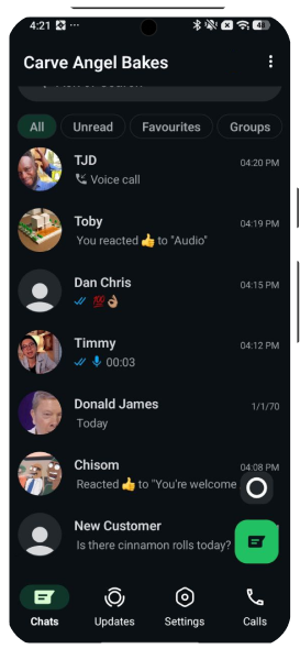
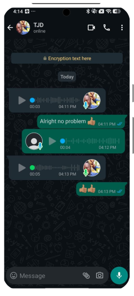
Orders, payment screenshots, and delivery details were scattered across DMs. Items got missed, double-booked, or lost in a sea of half-finished conversations.
The Customization Gap
Bakery items live and die by detail, flavour, size, message on the cake, dietary needs. Free-text chat made it almost impossible to capture every variation cleanly and consistently.
Scalability
As the brand grew, the volume of DMs outpaced what one person could answer. Manual replies became a ceiling on how much the bakery could actually sell.
03
The Solution.
Crave Angel Bakes is a focused mobile storefront that turns a chaotic inbox into a calm, branded ordering experience available around the clock.
- A 24/7 ordering platform that automates the manual back-and-forth and lets customers buy without waiting on a reply.
- Structured customisation for every item — flavours, sizes, messages, and add-ons captured as real fields, not free text.
- A streamlined checkout with clear pricing, delivery options, and payment confirmation in one continuous flow.
- A premium visual identity built around warm imagery and generous whitespace so the product — the food — does the selling.
Before
The chat origin.

Hi-Fi Designs
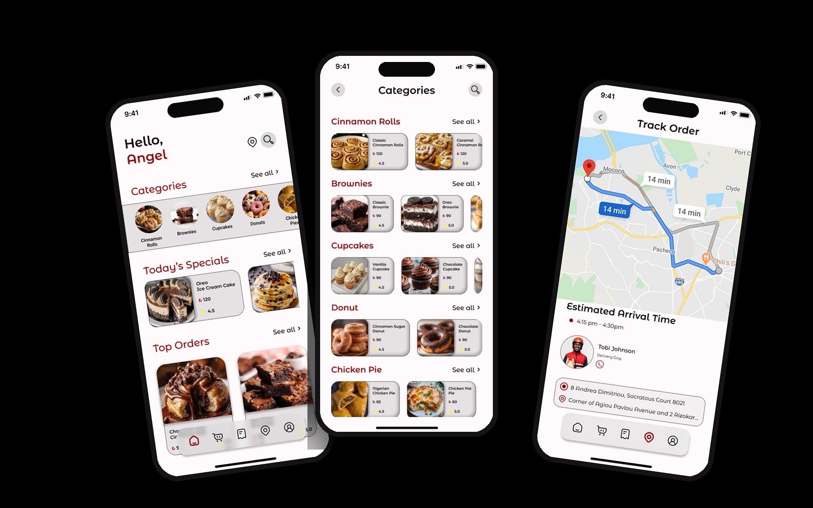
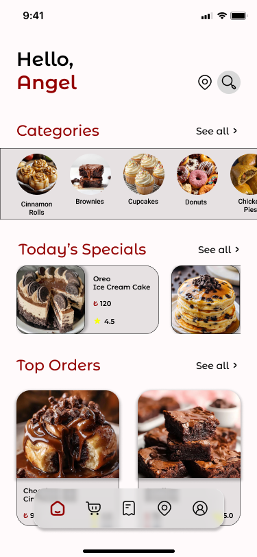
The storefront.
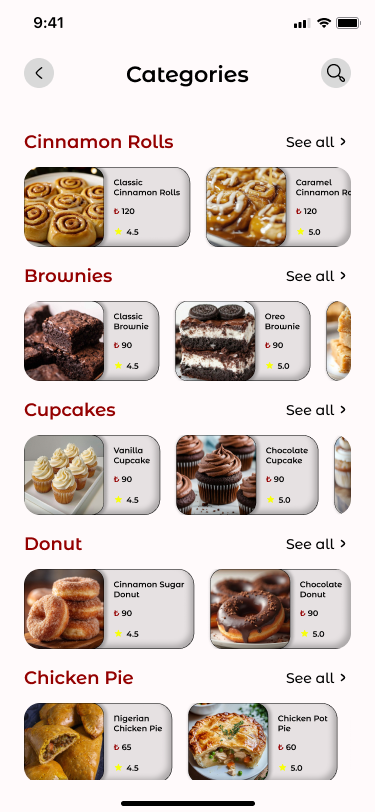
The main app screens, home page, categories, and a live tracking screen, are built around clean white space and warm food photography.
04
Project Result.
The shift from a social-media feed style of selling to a dedicated digital store reframed Crave Angel Bakes as a real brand, not just a page. Operationally, customisations are captured cleanly, orders stop slipping through the cracks, and the bakery is no longer gated by how fast one person can type a reply.
Visually, the product moves from busy chat threads to a quiet, confident storefront, closer to a premium dessert boutique than a DM queue.
05
Key Learnings.
High Quality Food Imagery
For a bakery, the photo IS the menu. Consistent, well-lit imagery did more for conversion than any line of copy.
The Psychology of Choice
Too many options paralyse. Grouping flavours, sizes, and add-ons into clear steps made customisation feel like a treat instead of a form.
Friction in Ordering
Every extra tap between craving and checkout costs an order. Removing friction was as important as adding features.
Final Reflection.
The hardest part of this project wasn't building screens, it was carrying the warmth of the brand into a digital interface. Crave Angel Bakes reminded me that good product design for small brands isn't about more features; it's about protecting the soul of the business as it scales.