Case Study
JIJI Redesigned — a calmer way to shop JIJI.
A self-initiated redesign of one of Africa's largest marketplaces, trading visual noise for clarity, and turning utility into delight.
01
Project Overview.
The Goal
Reimagine the JIJI mobile marketplace as a more intuitive, modern shopping experience, easier to scan, easier to trust, and easier to actually finish a purchase on.
The Client
A personal project inspired by JIJI, one of the largest classifieds platforms in Africa. The redesign is unsolicited and concept-only, shaped purely around real user pain points.
The Task
Lead the full UX/UI redesign, from auditing the current product and interviewing buyers, to defining a new visual system and shipping high-fidelity flows for browsing, listing detail, and checkout.
02
The Problem — the "why".
Cluttered Interface
Categories, banners, ads, and listings all compete for the same screen real estate. Users land in the app and don't know where to look first.
Navigation Difficulty
Core actions like filtering, switching categories, and contacting a seller are buried under inconsistent patterns and tiny tap targets.
Information Overload
Listings present every possible attribute at once. Buyers have to work hard to spot what actually matters: price, condition, location and whether the seller looks trustworthy.
03
The Opportunity.
The opportunity wasn't to add more — it was to remove and re-rank. By treating each screen as a hierarchy of decisions (browse → consider → contact), the redesign creates a calmer marketplace that still feels fast and dense enough for power users.
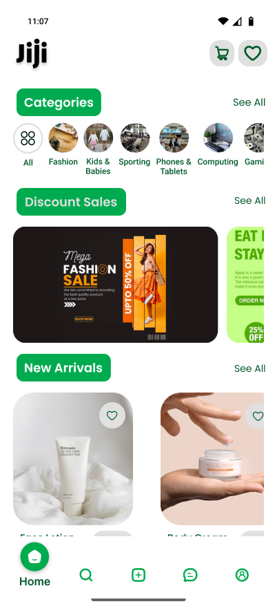
- A modern card-based feed that lets product photos breathe and pushes price + location to the front.
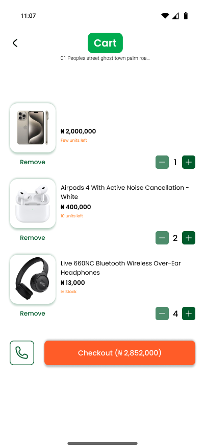
- A confident green CTA system so the next step is always obvious — Call, Chat, or Buy.
- Trust signals up top — verified sellers, response time, and rating shown before specs.
Research & Data
Listening before designing.
User surveys with everyday buyers and a competitive sweep of regional marketplaces shaped the redesign brief.
78%
found the current feed overwhelming
64%
abandoned a listing before contacting
3.1×
more taps to checkout vs. competitors
04
Design Process — from utility to delight.
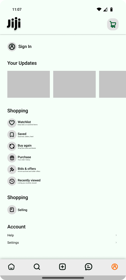
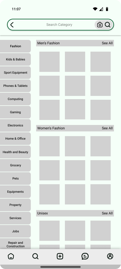
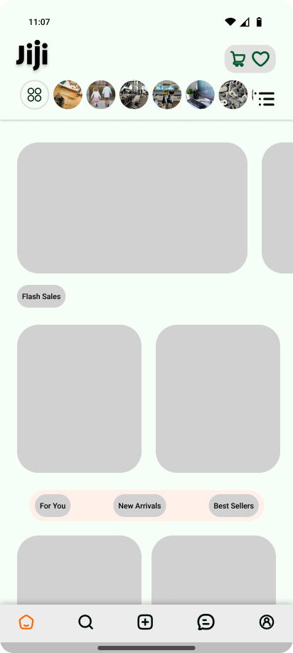
The first goal was to fix the bones. Wireframes stripped every screen back to grayscale blocks so layout, hierarchy and tap order could be tested without colour or imagery distracting the conversation.
Style Guide
A bold, dependable system.
Palette
Green for action, orange for brand moments, white for clarity, dark for focus.
Typography
Aa
Montserrat Alternates — display
Inter — body, captions, prices
Components
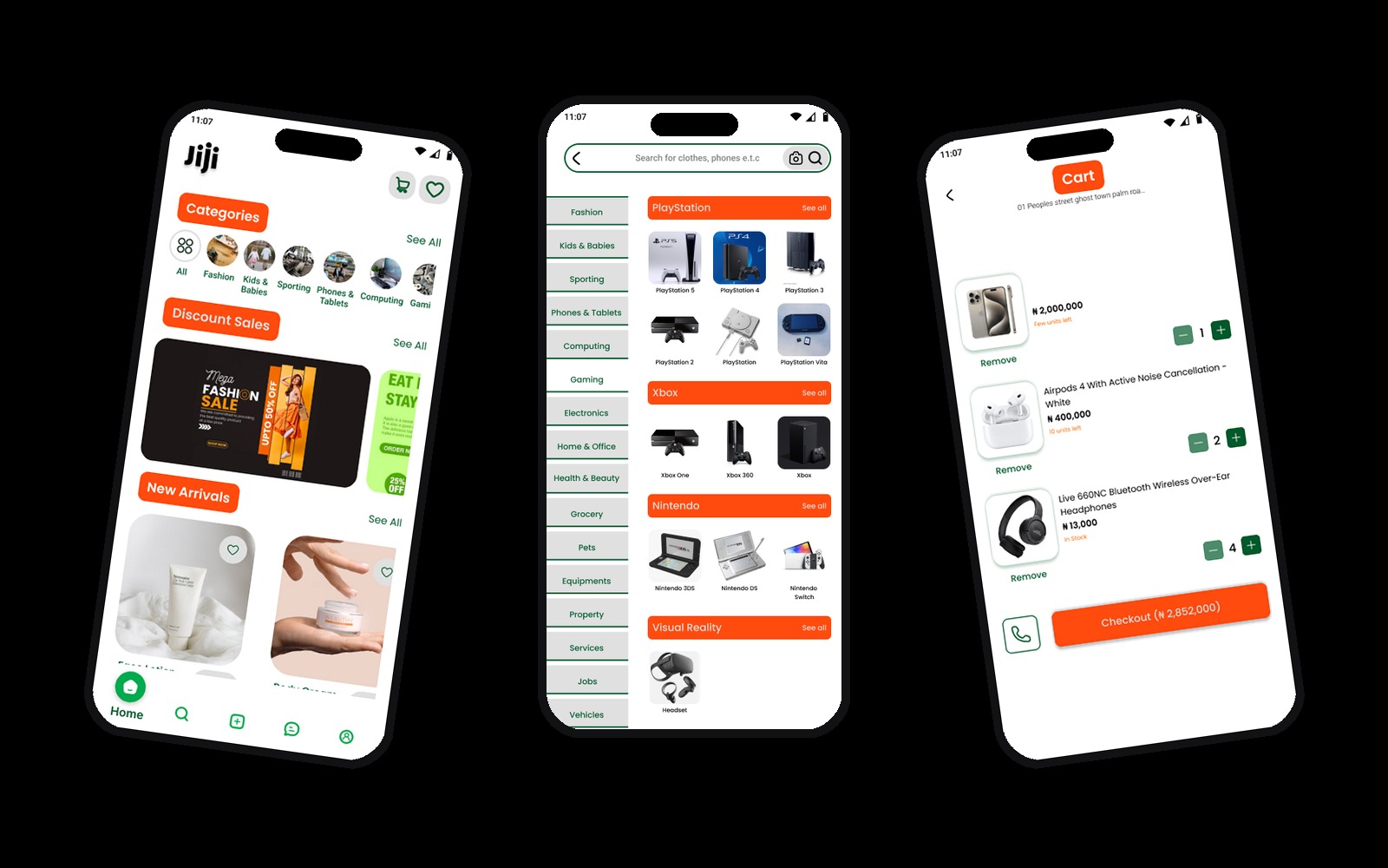
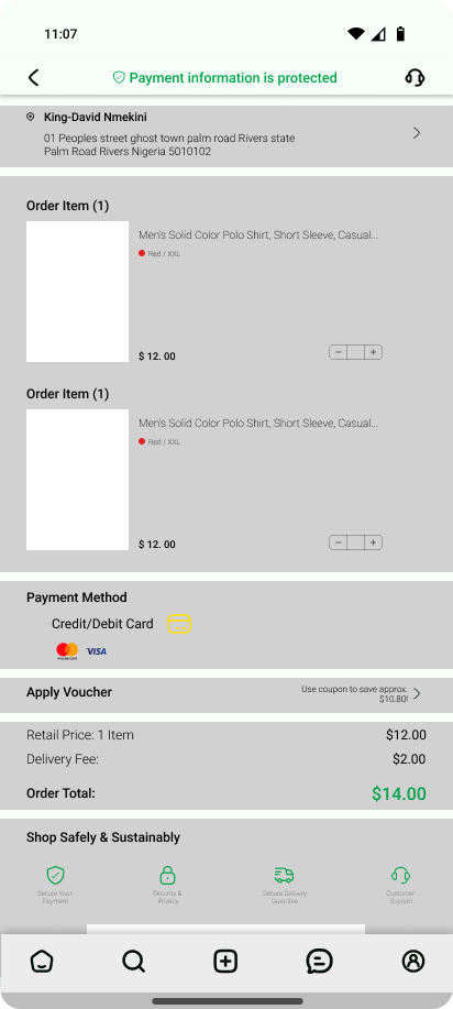
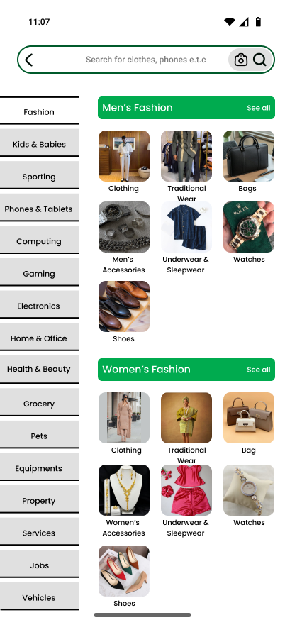
Hi-Fi Designs
The new marketplace.
A clean, card-based interface anchored by green CTAs, built so the next decision is always one tap away.
05
Challenges — overcoming constraints.
The hardest balancing act was respecting how dense JIJI naturally is (millions of listings, dozens of categories) while still making the first screen feel calm. Cutting too much made the app feel empty; cutting too little kept the original noise.
The answer was hierarchy, not deletion, same content, ranked by what a buyer actually decides on first.
06
Takeaways & Learnings.
The Power of User Feedback
Five honest interviews reshaped the brief more than weeks of guessing. Real friction is almost never where designers assume it is.
Simplifying Complexity
A marketplace can be both deep and calm. The trick is choosing what gets the loudest pixel, usually price, photo, and trust.
Visual Hierarchy
Typography, spacing, and one strong accent colour did more for clarity than any new feature could.
Final Reflection.
JIJI Redesigned was a reminder that great product design often looks like restraint. The goal wasn't to make JIJI look like a different app; it was to let the same powerful marketplace finally feel as confident as it actually is.